
-
 About Ideali
- What Is Ideali 1 min read
- Why Ideali Is Different 1 min read
- Who Can Use Ideali? 1 min read
- $0 Platform fees 1 min read
- Instant Payouts, Get Paid the Moment Your Donors Give 2 min read
-
 Getting started with Ideali
- Creating Your Ideali Account 1 min read
- Setting Up Your Organization Profile 1 min read
-
 Dashboard
- Navigating your Ideali dashboard 2 min read
-
 Campaign Management
- Creating a Donation Campaign 2 min read
- Using the AI description and banner generator 2 min read
- Customizing your thank you email 1 min read
- Managing your campaign after publishing 2 min read
- Share your campaign 2 min read
- Duplicating or Cloning your campaign 2 min read
- Managing Your Archived Campaigns List 2 min read
-
 Finances & Payments
- Setting Up Your Payment Account 1 min read
- Preset donation amounts, fixed & recurring 2 min read
- Viewing and filtering payments 2 min read
- Payment methods accepted on Ideali 1 min read
- Why payments fail and how to fix them 2 min read
- Managing Your Donors List 2 min read
- Managing Recurring Donations 2 min read
-
 Tap to pay
- What is Tap to Pay 2 min read
- Setting up Ideali Tap to Pay 2 min read
- Tap to Pay Trouble Shooting 3 min read
-
 Integration & Embeds
- Embedding Your Donation Campaign in WordPress 2 min read
- Connecting QuickBooks in Ideali 2 min read
- Connecting Constant Contact in Ideali 1 min read
-
 Account Management
- Sub Profiles to Manage Multiple Campaigns 2 min read
- Setting Up Roles & Users 3 min read
- Securing Your Ideali Account 2 min read
-
 Memberships
- Creating and Managing Membership Types 5 min read
- Managing Members Profiles 2 min read
- Reviewing Pending Membership 3 min read
- Membership Payments and Invoices 3 min read
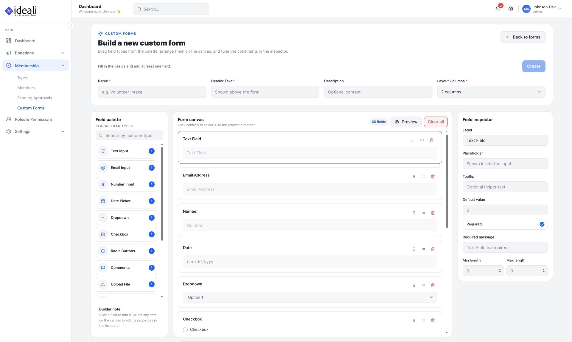
- Building Custom Forms for Membership 3 min read
-
 Ideali for Donors
- Make a Donation Through Ideali 2 min read
- Optional donor tips 1 min read
- Make a Recurring Donation 1 min read
- Your Donation Receipt 2 min read

The modern donation platform that helps nonprofits raise more with easy-to-use, customizable forms and powerful analytics.
Products
Company
Resources
Legal
© Copyright 2026 Ideali.io | All rights reserved.

The modern donation platform that helps nonprofits raise more with beautiful, customizable forms and powerful analytics.
© Copyright 2026 Ideali.io | All rights reserved.
Products
Company
Resources
Legal
The modern donation platform that helps nonprofits raise more with beautiful, customizable forms and powerful analytics.
© Copyright 2026 Ideali.io | All rights reserved.